Through design, I seek to form a seamless marriage of exciting visual elements and clear, bold and compelling typography to convey as well as thrill.
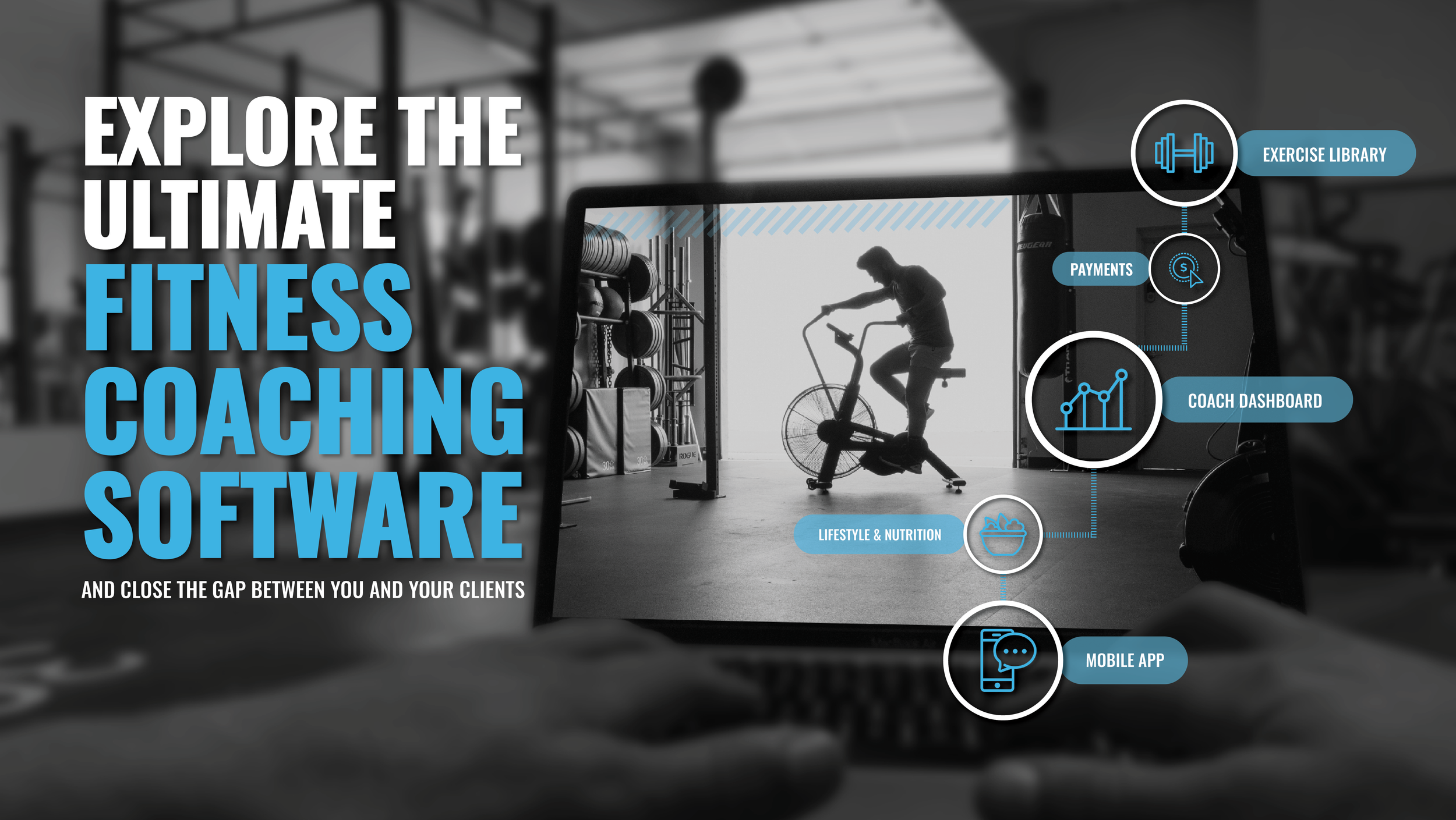
Product promotion…
…has meant a lot of different things to me over the years, as I’ve worked on technology products with a tangible offering as well as education products that require a more figurative illustration. The opportunity to explore the unique challenges these different projects pose has given me range as a designer that serves me well in adapting to the needs of new projects without a hitch. Here are some examples of design collateral created to promote products, partnerships and possibilities.
Logo design…
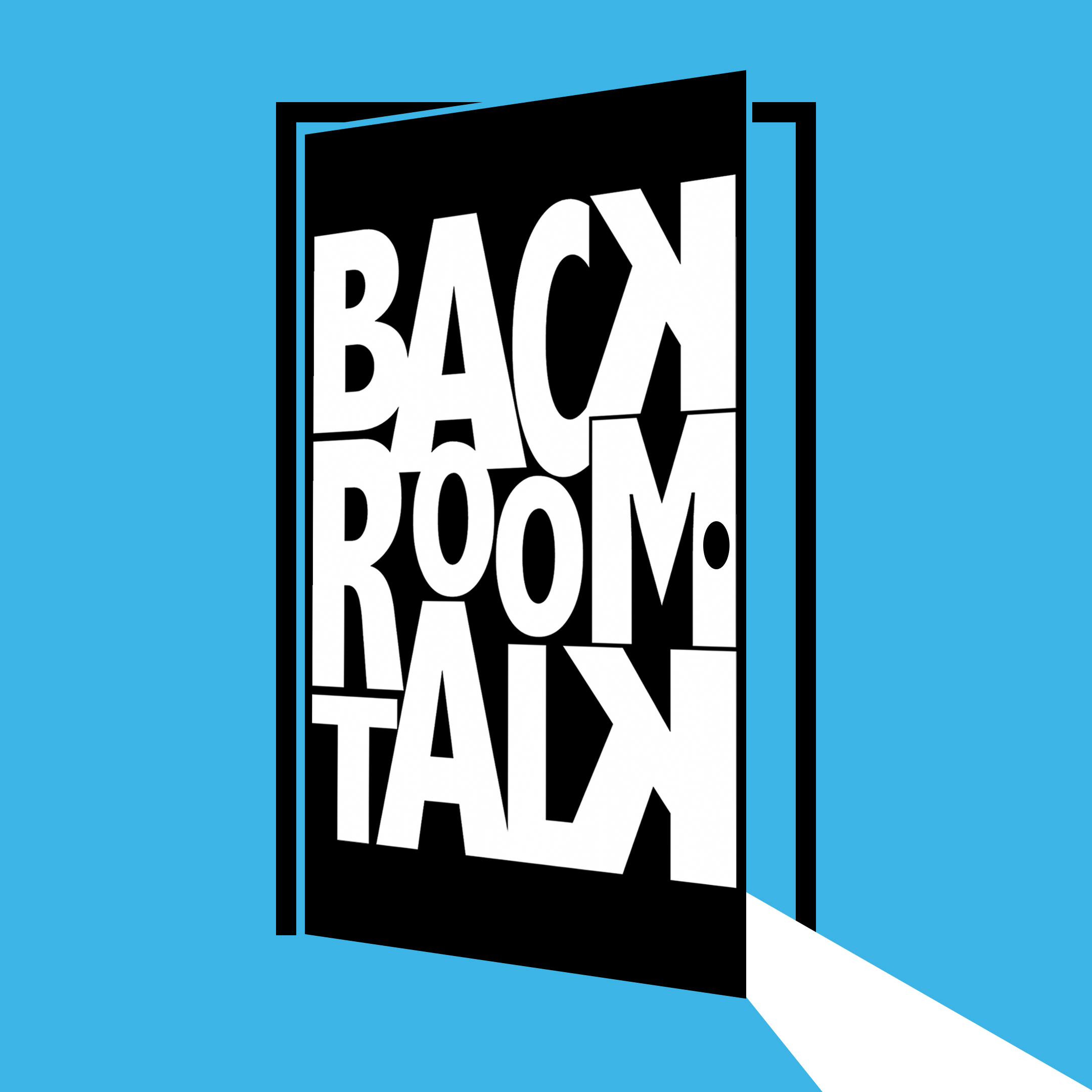
…is a particularly fun challenge for me as a designer. It’s both the smallest canvas I tend to work on, but also, at the same time, has the largest impact on how a brand is recognized and perceived by our audience. Here are a few logos I had the privilege of developing for sister companies and a couple of podcasts. (And yes, I did write those taglines, too!)
Web design…
…falls on the other end of the spectrum. When designing webpage layouts, I’m working with the largest canvas and attempting to organize and clearly convey the largest quantity of information. And that’s what makes it such a fun and distinctive challenge! Here is the homepage for a proprietary coaching app, CoachRx. (You can view the full site here.)
Brand guidelines…
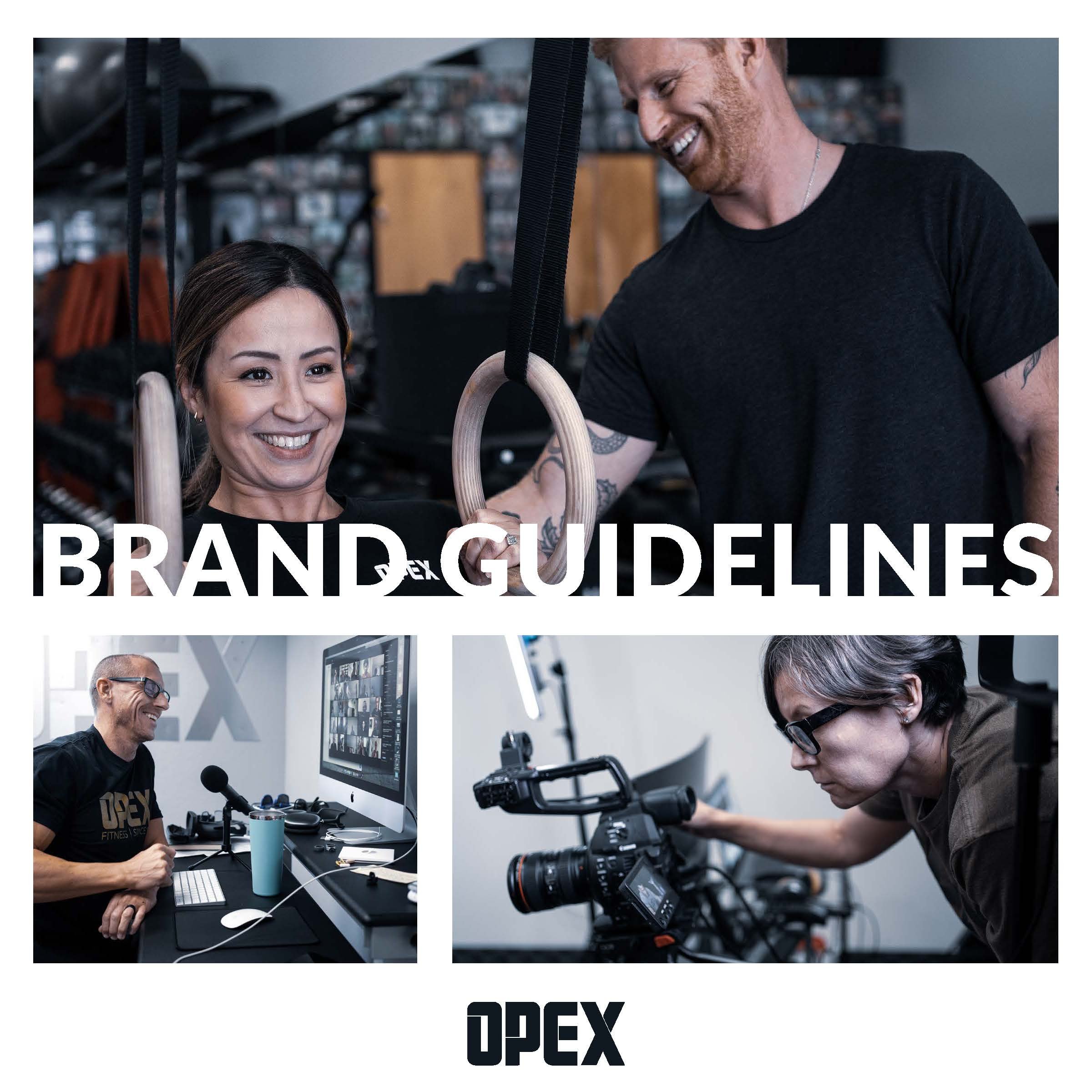
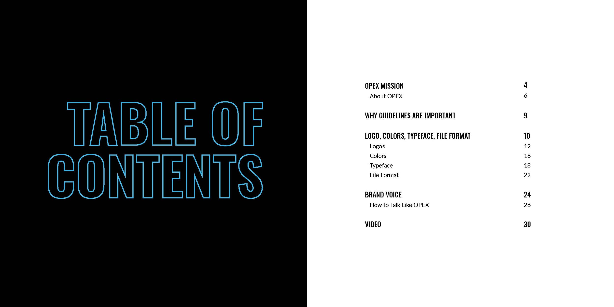
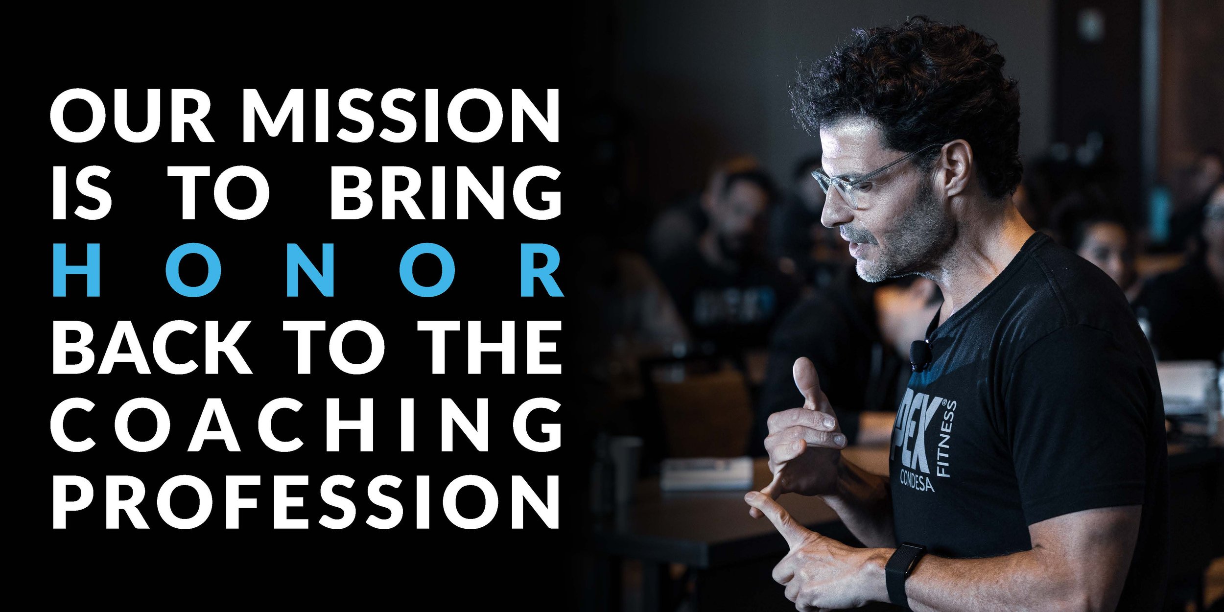
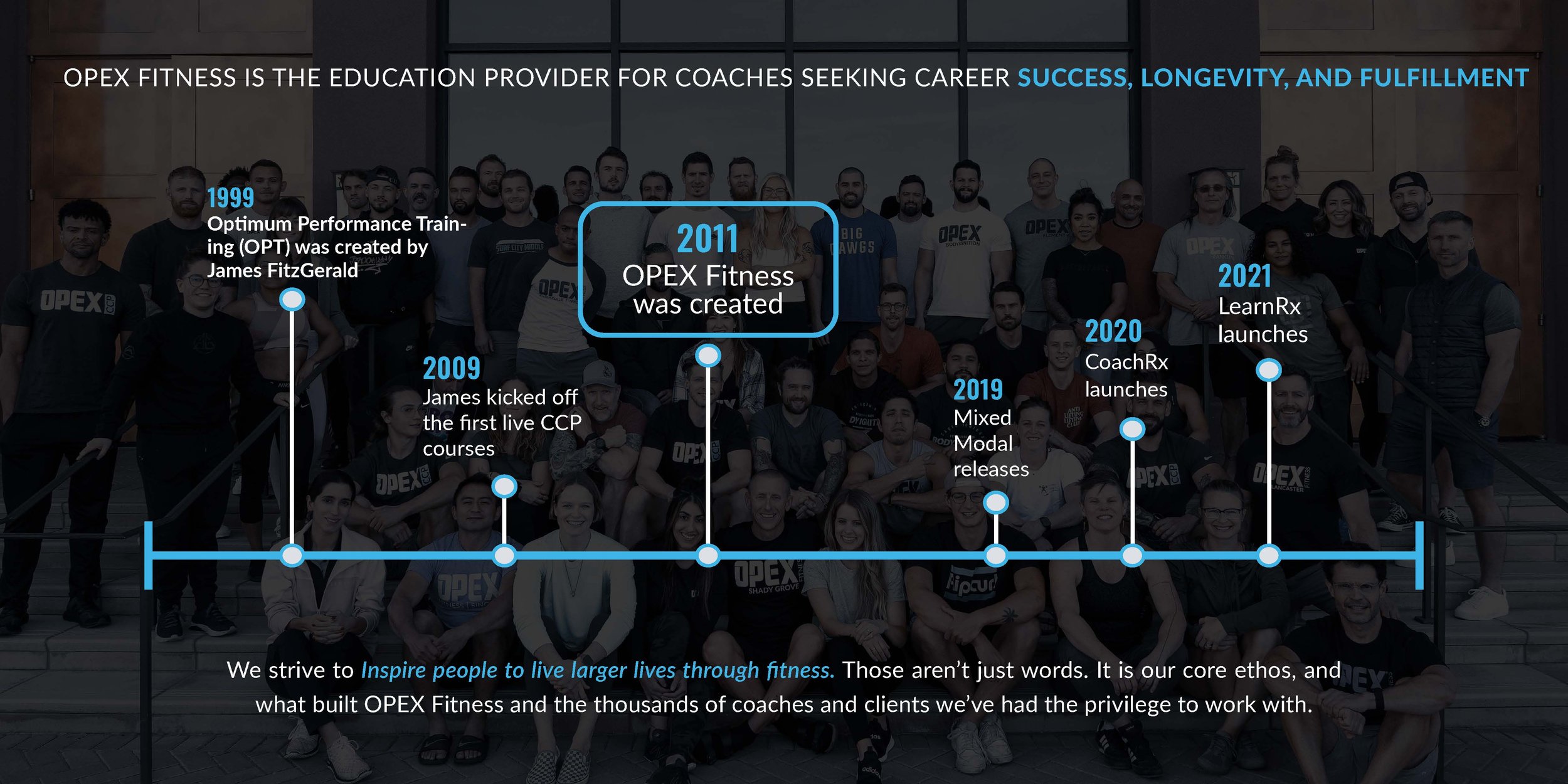
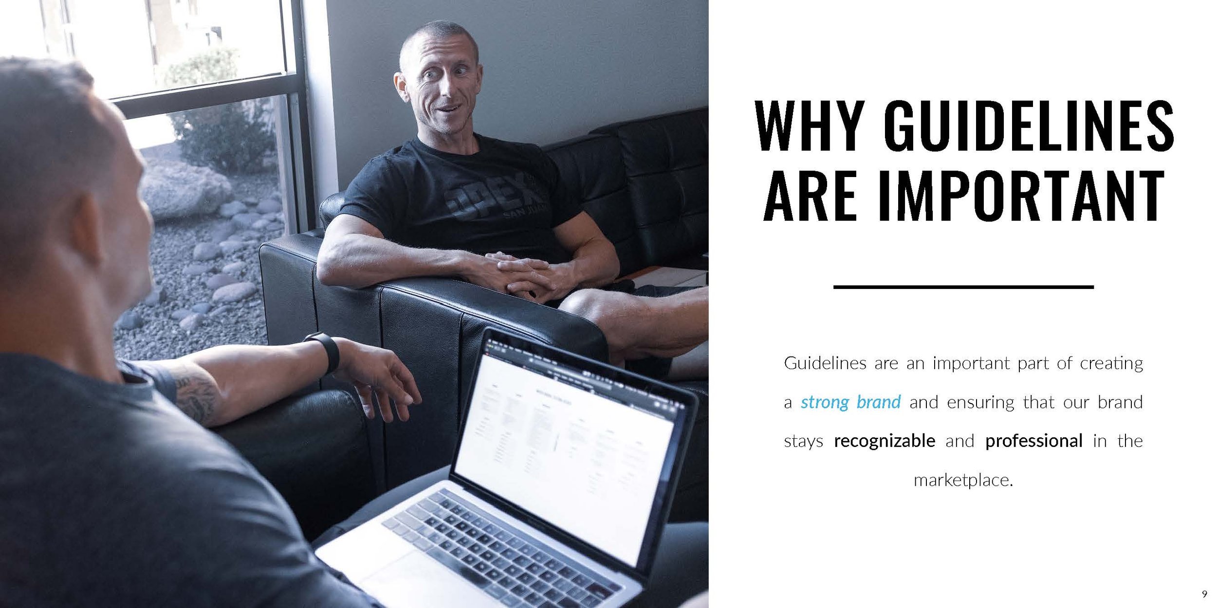
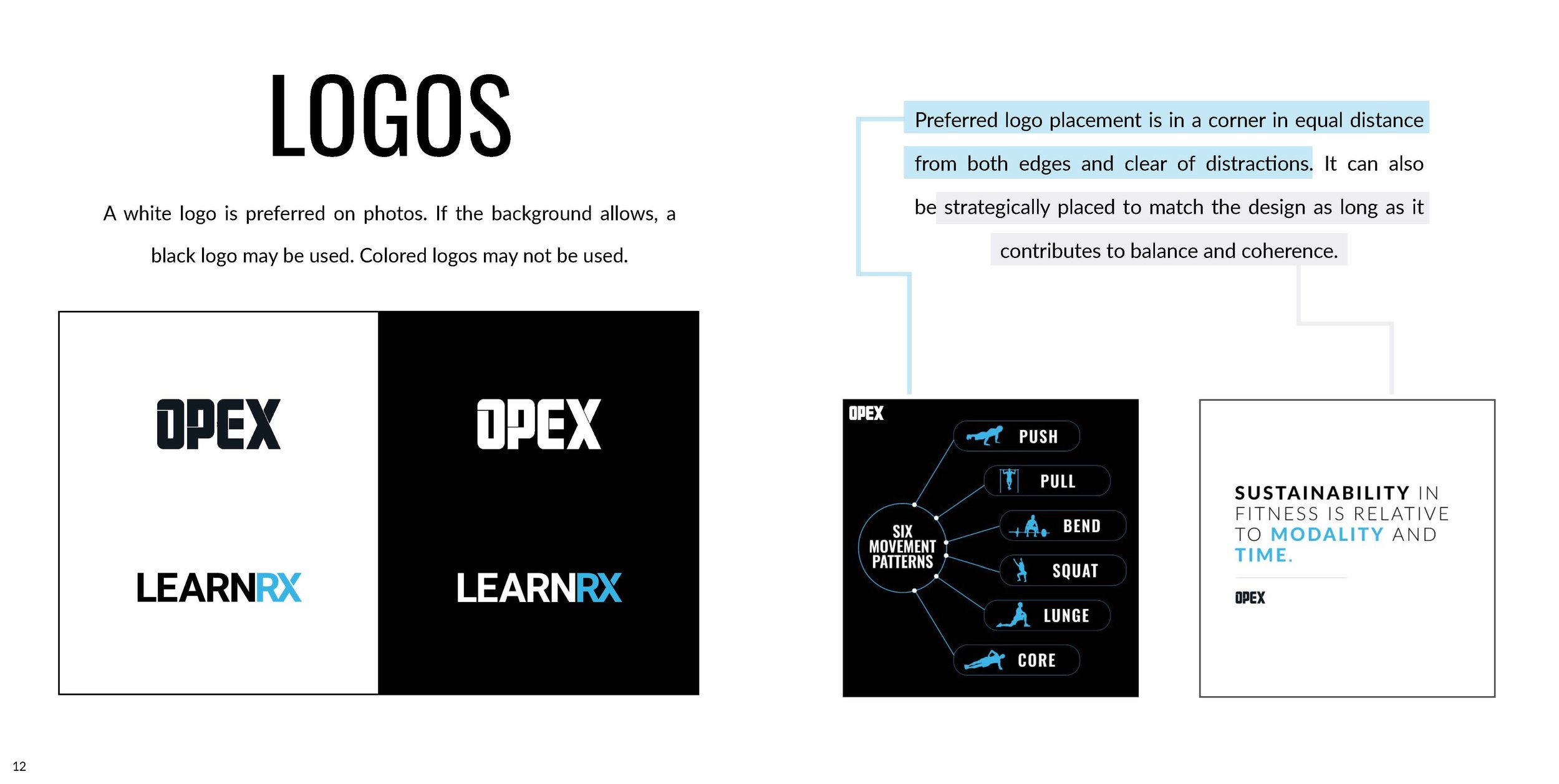
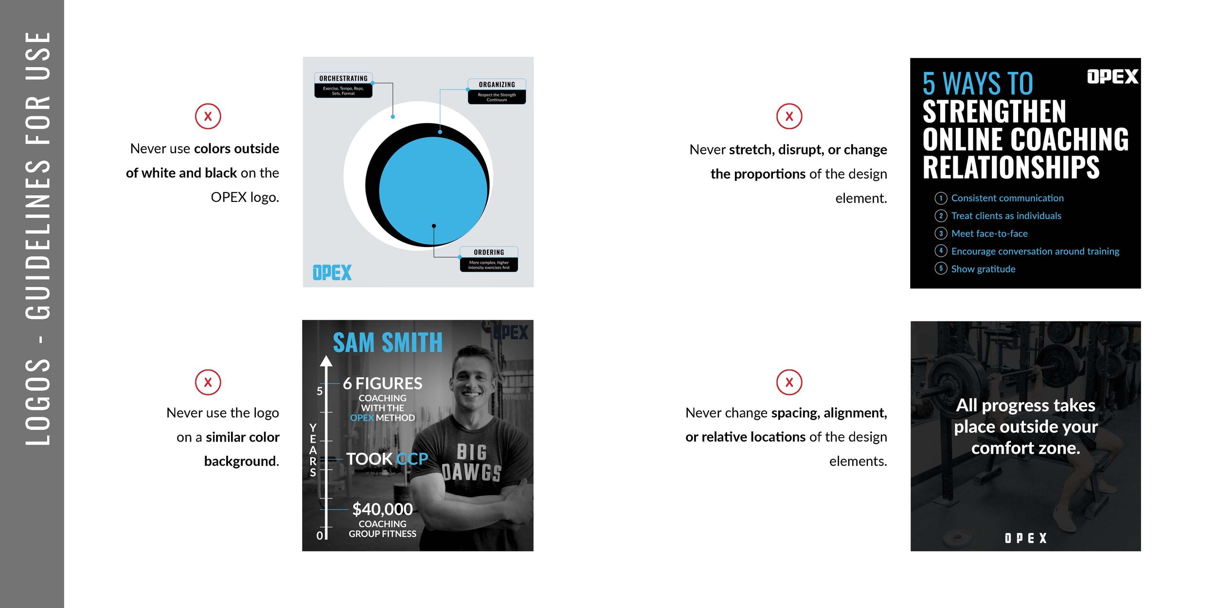
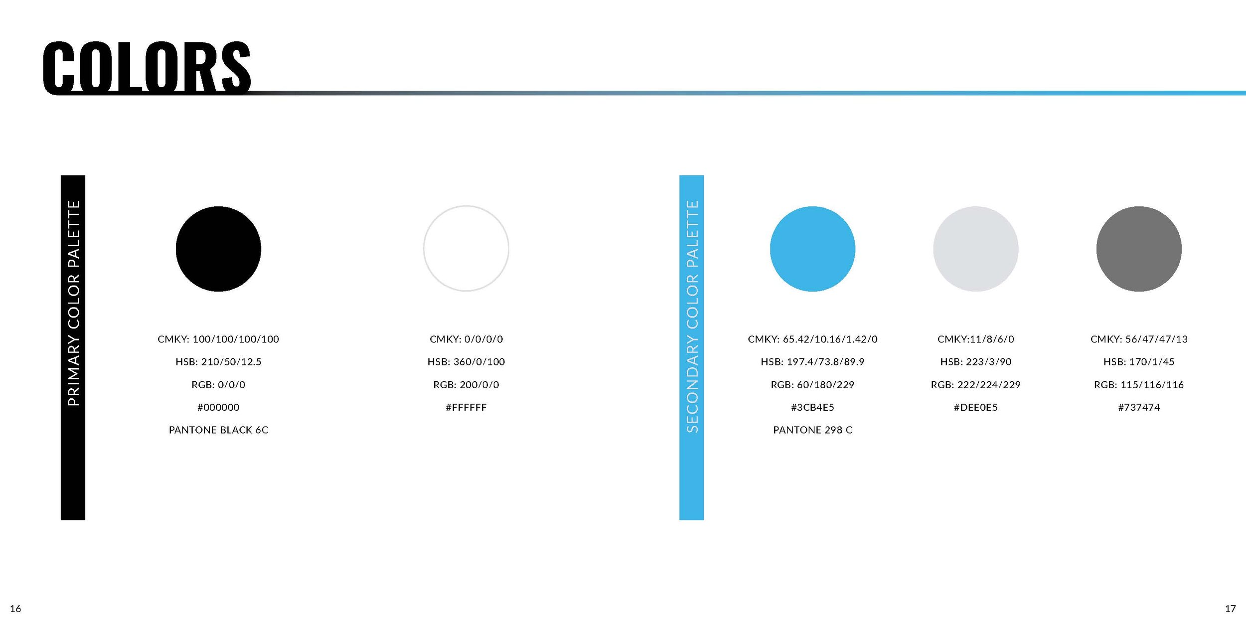
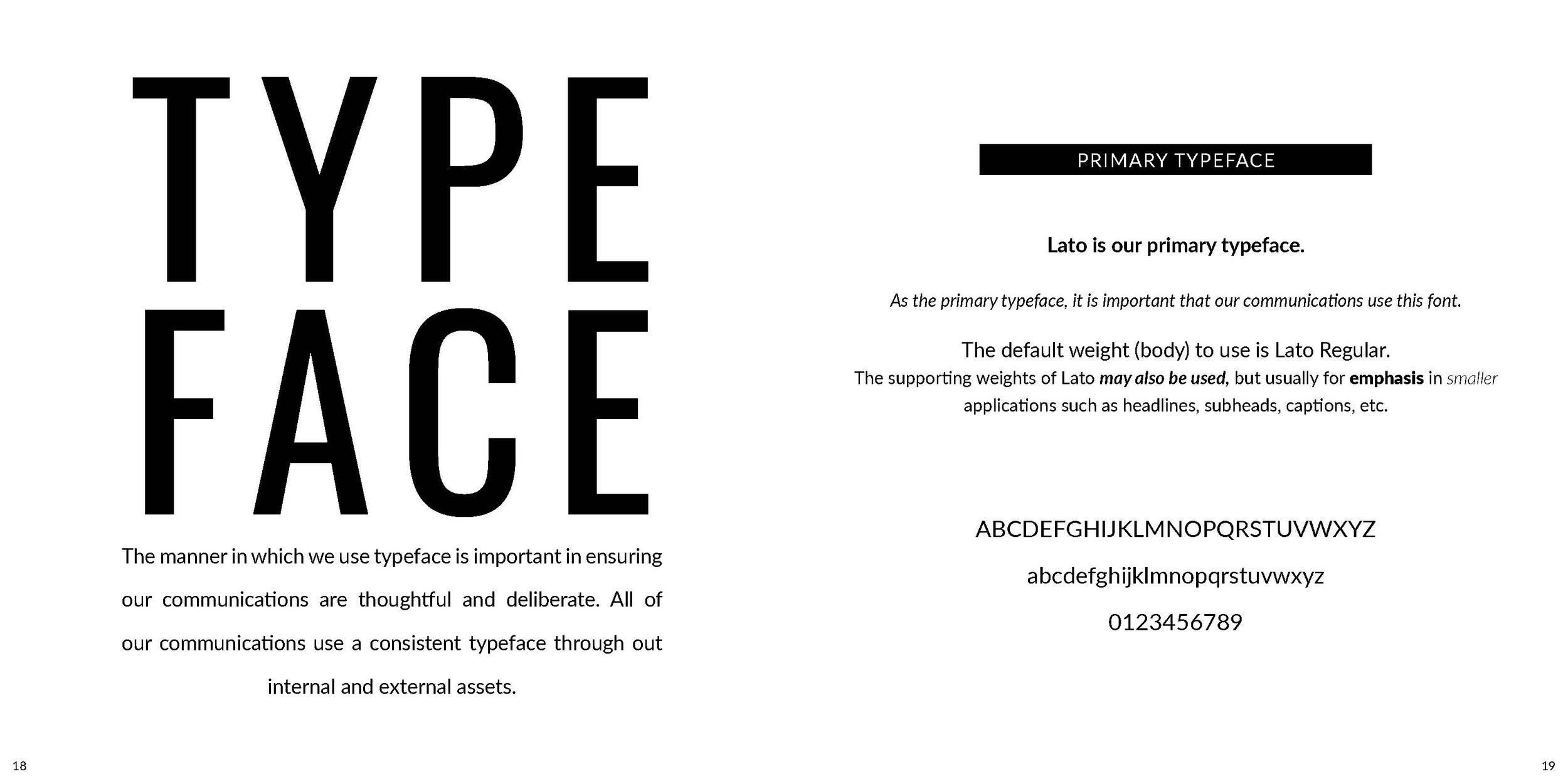
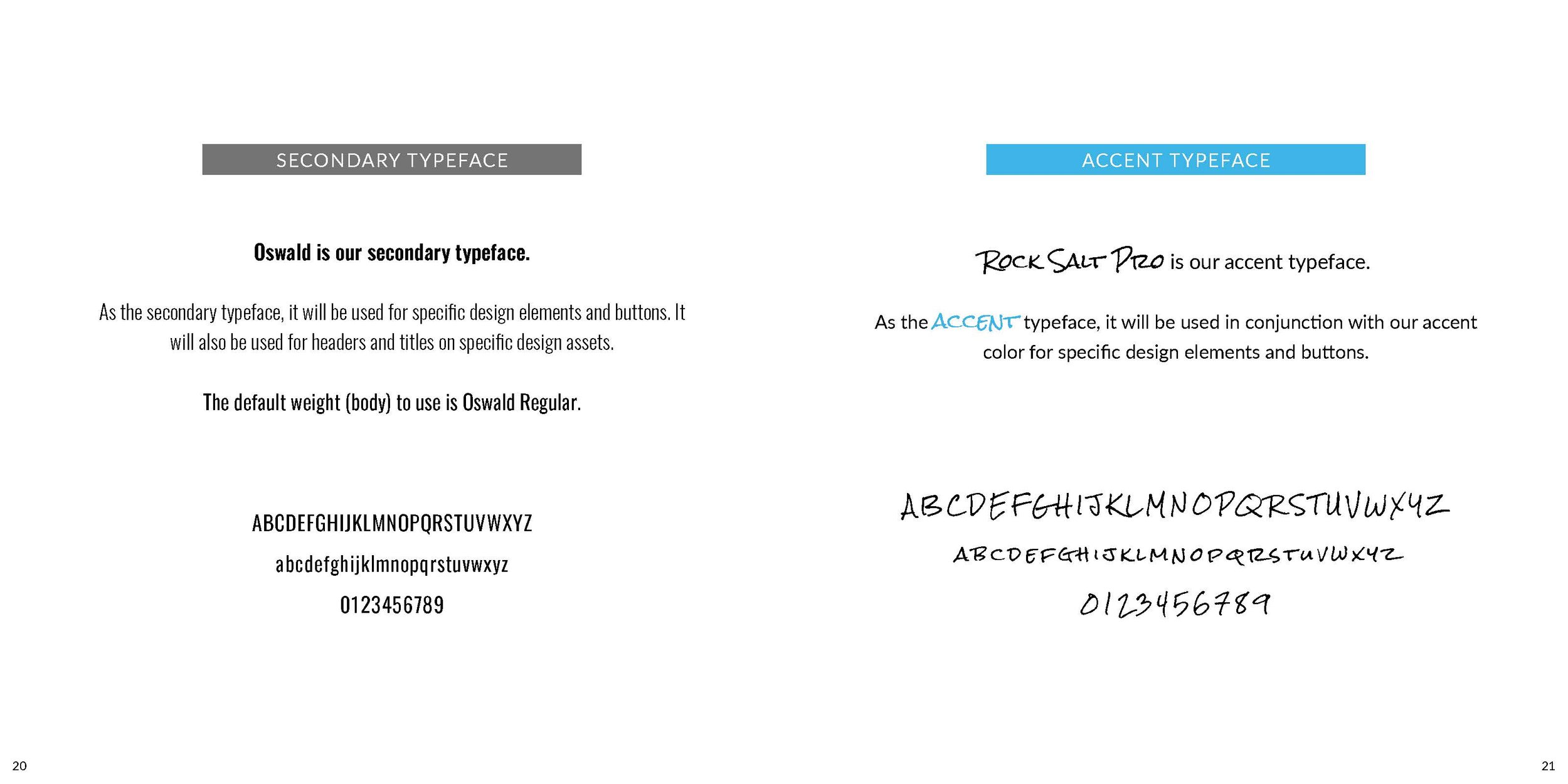
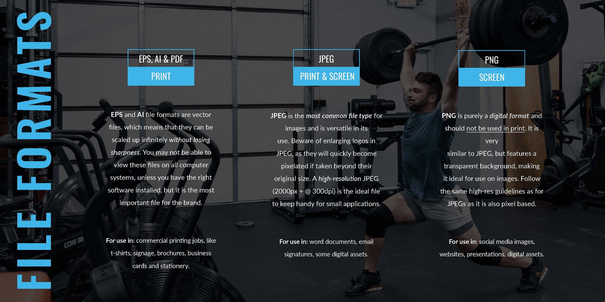
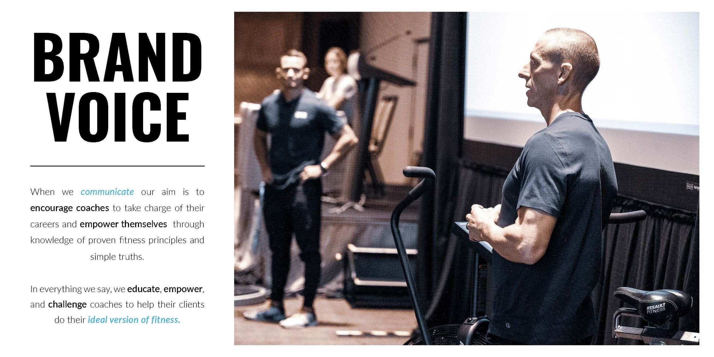
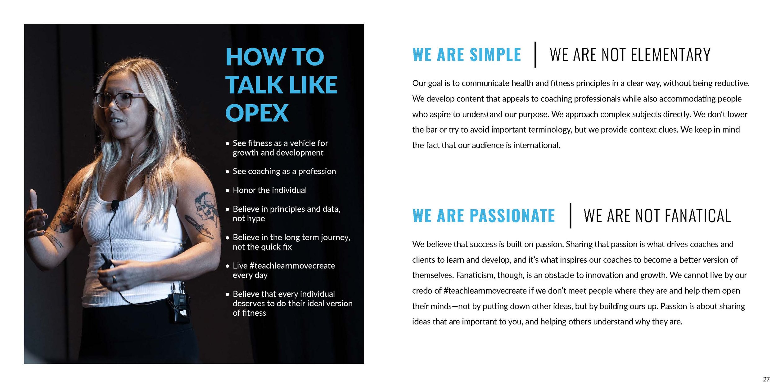
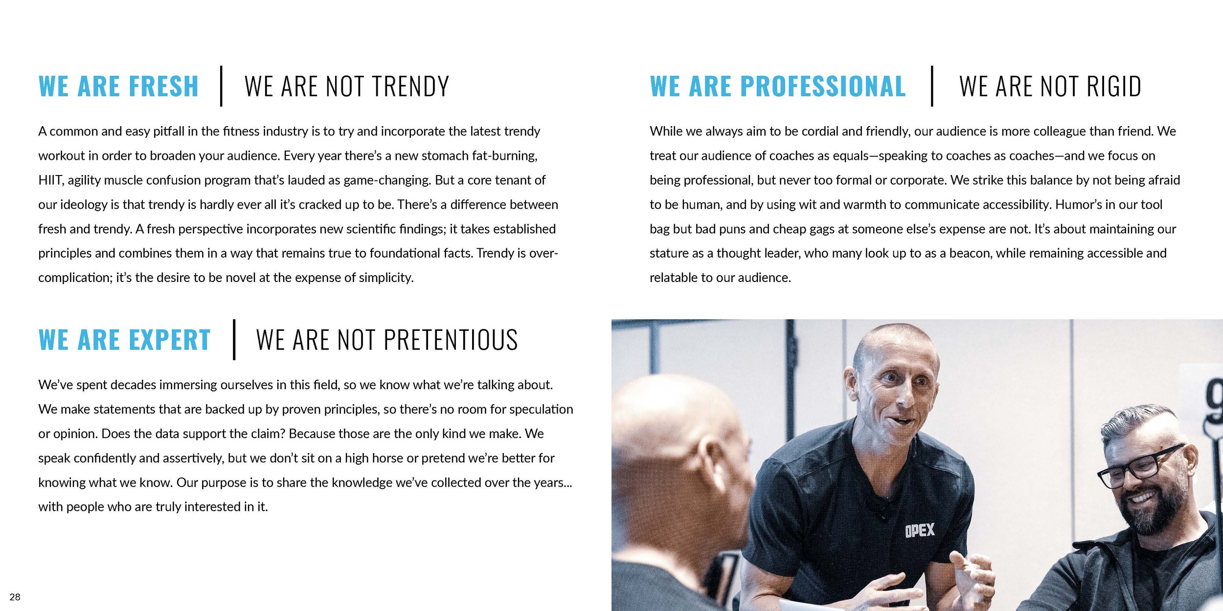
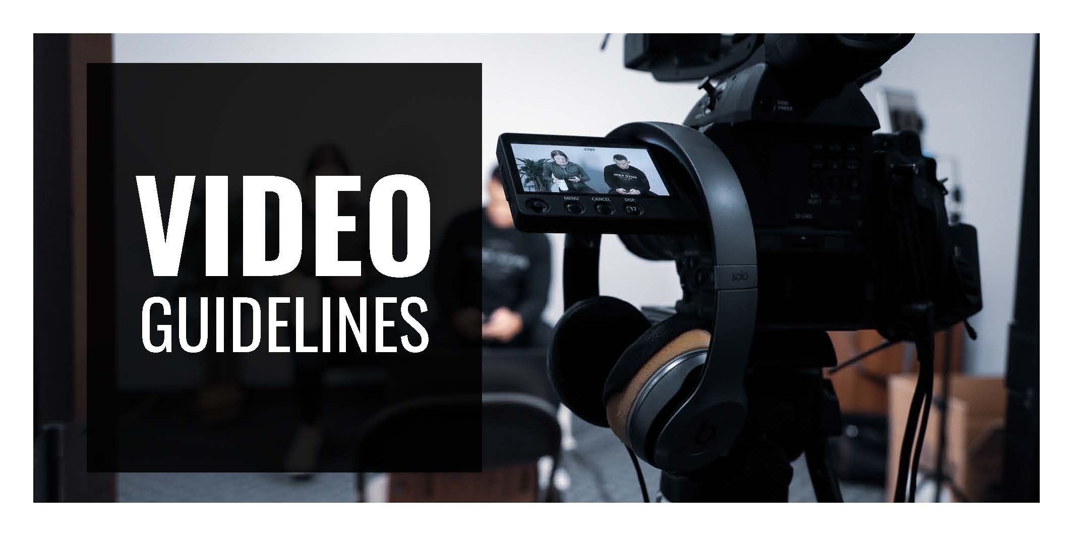
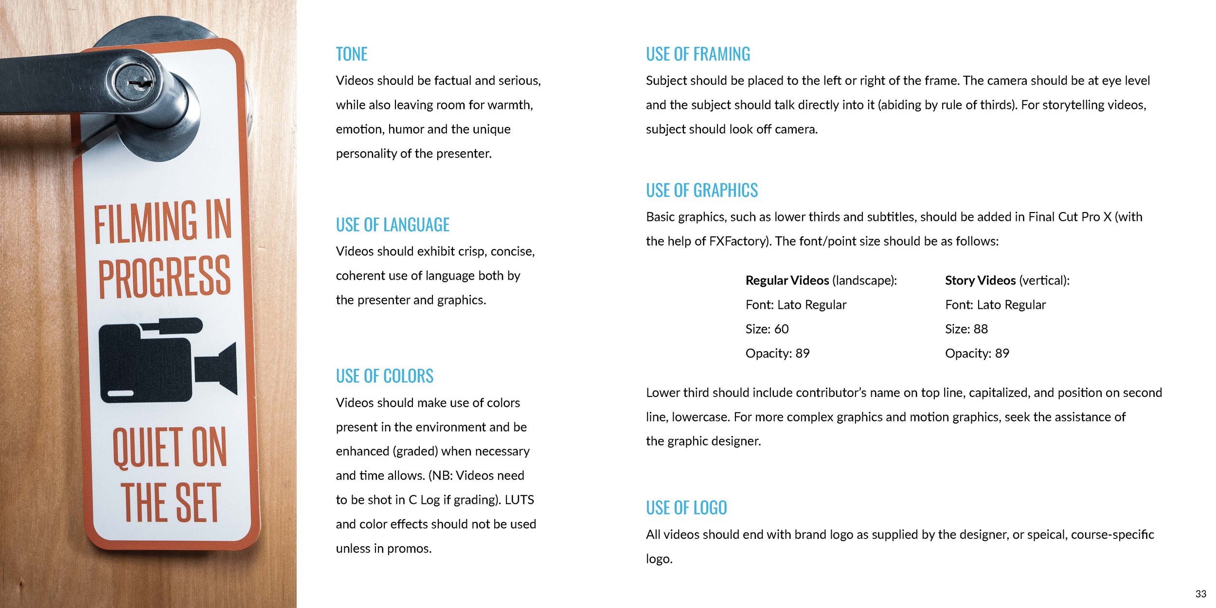
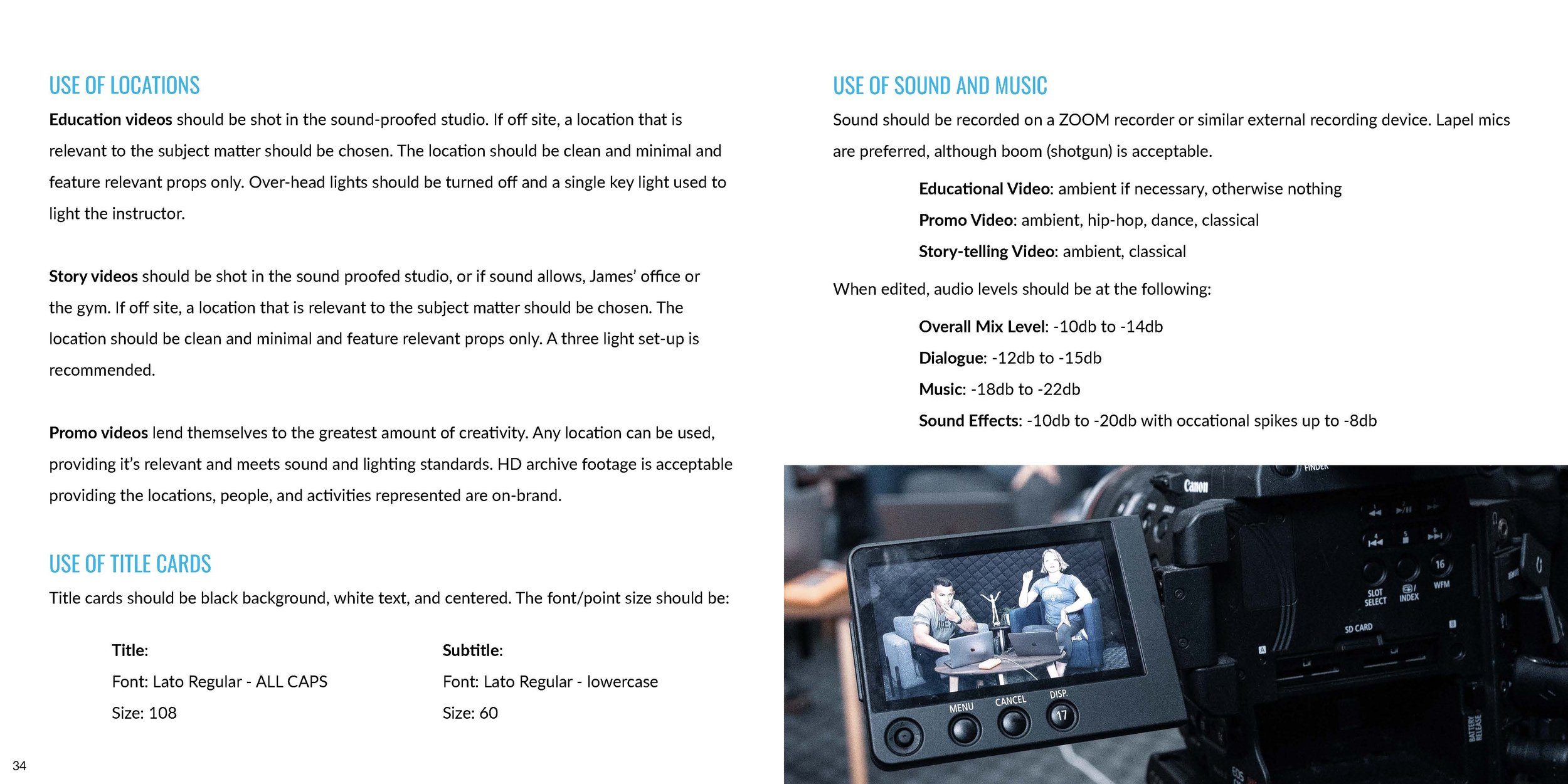
…are not only a keystone document for ensuring our internal team is always on the same page. They also serve as a comprehensive visual example to any external partners/contractors/etc of how we expect our brand to come to life. Here is the brand guidelines document my team and I created for OPEX Fitness.
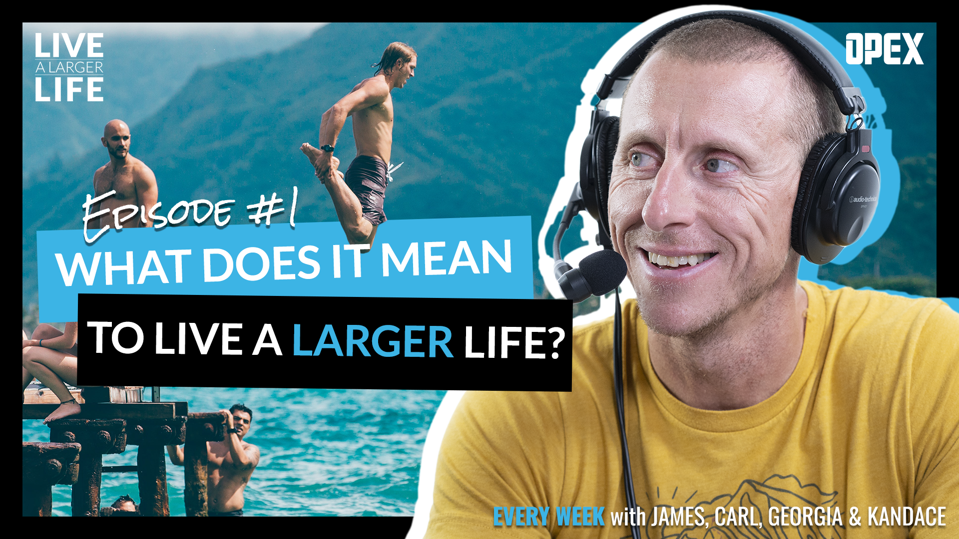
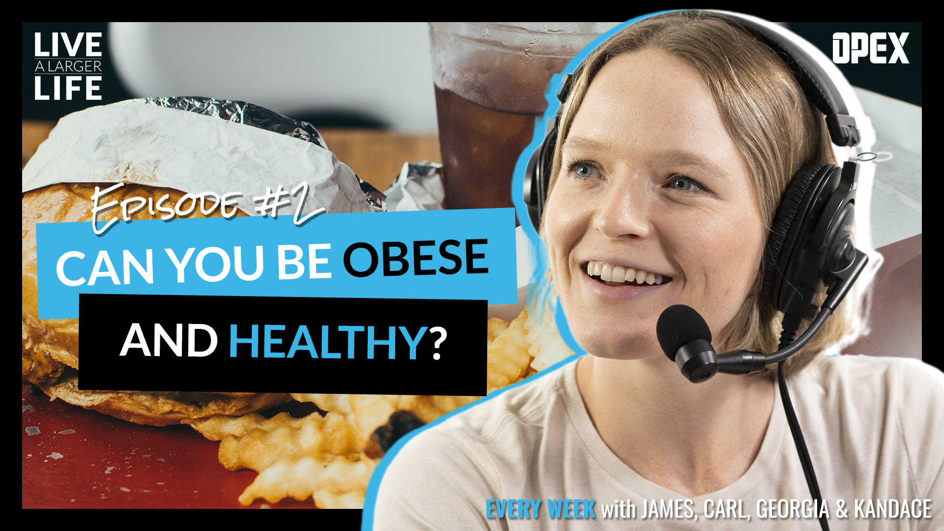
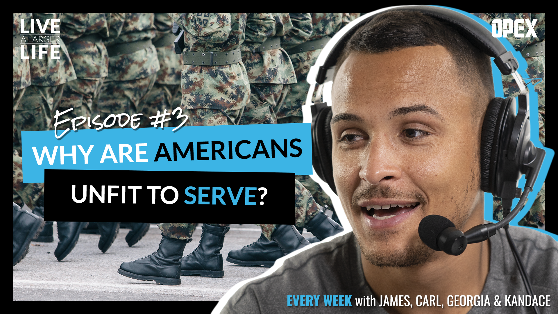
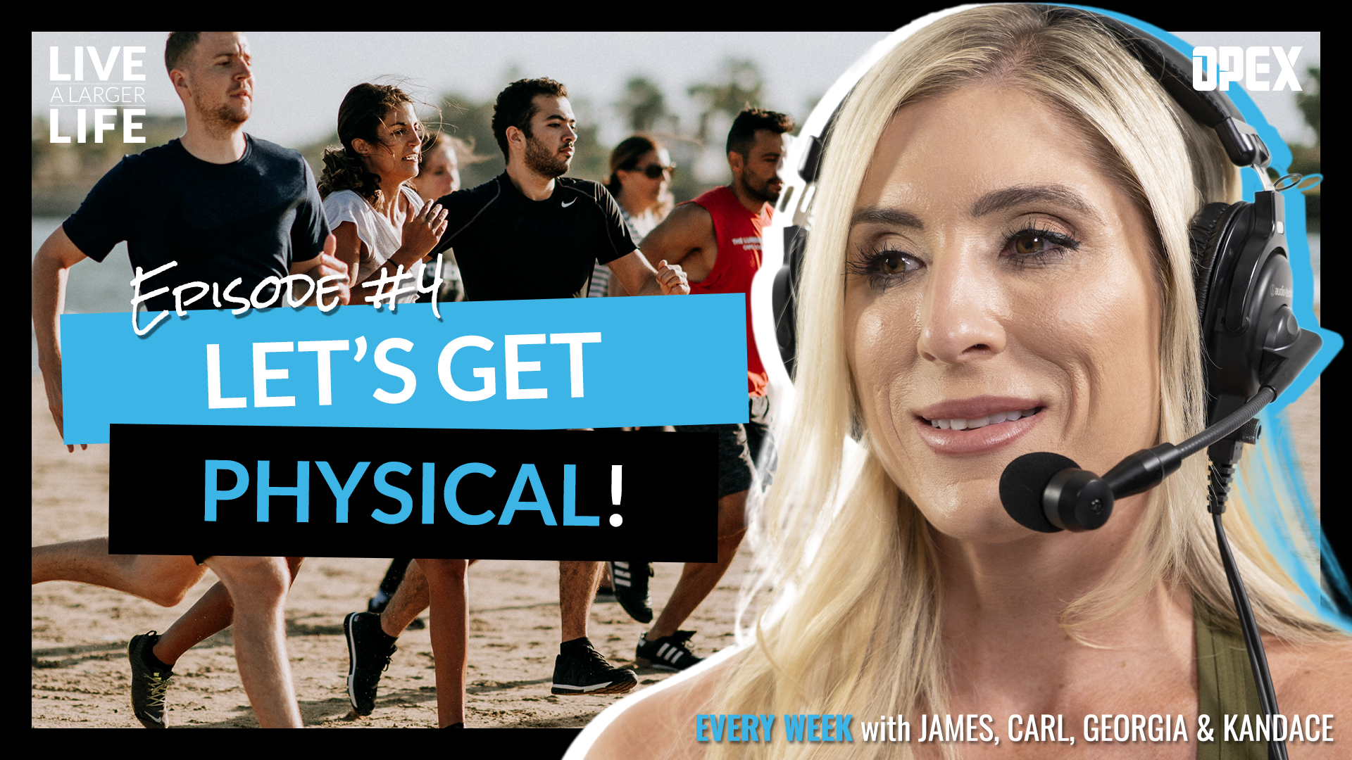
Campaigns…
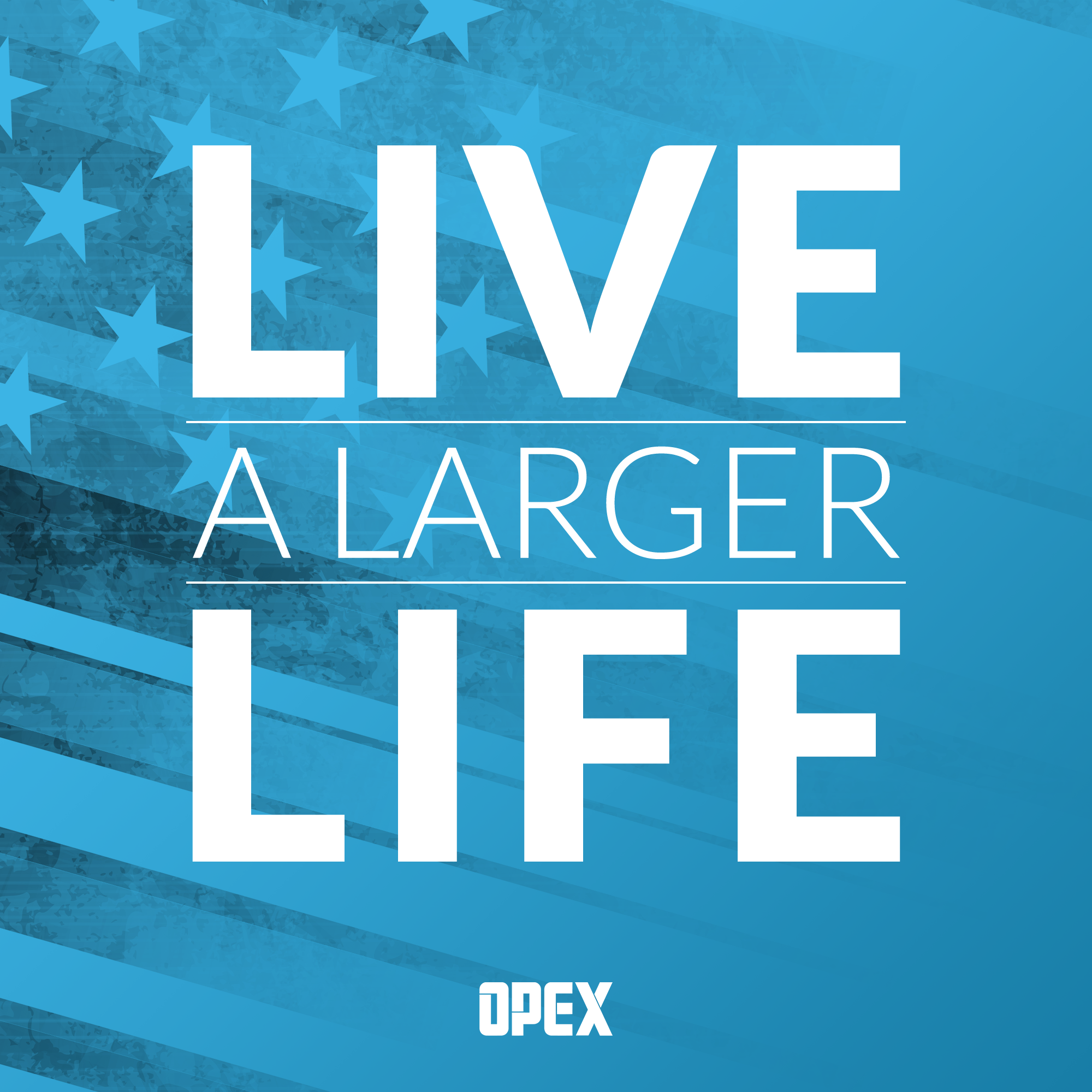
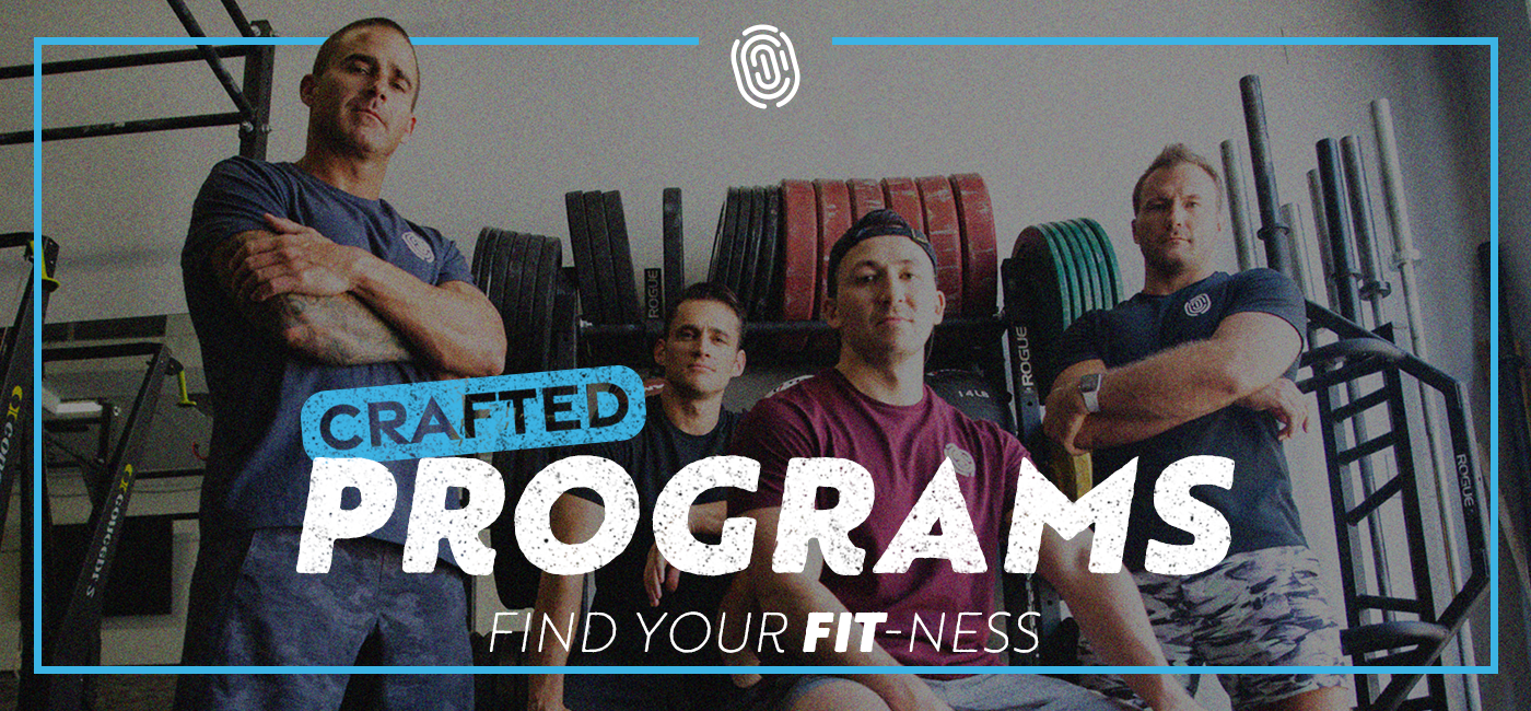
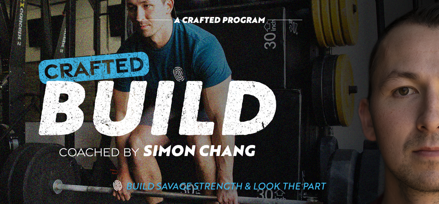
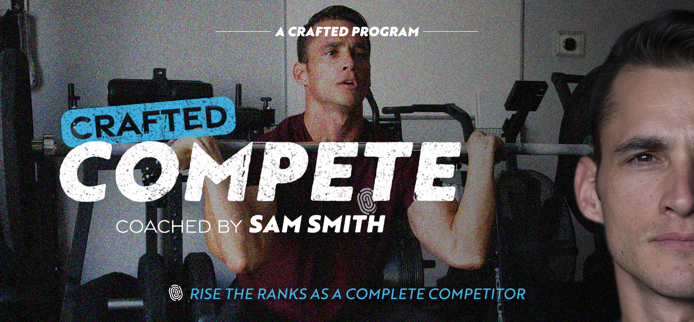
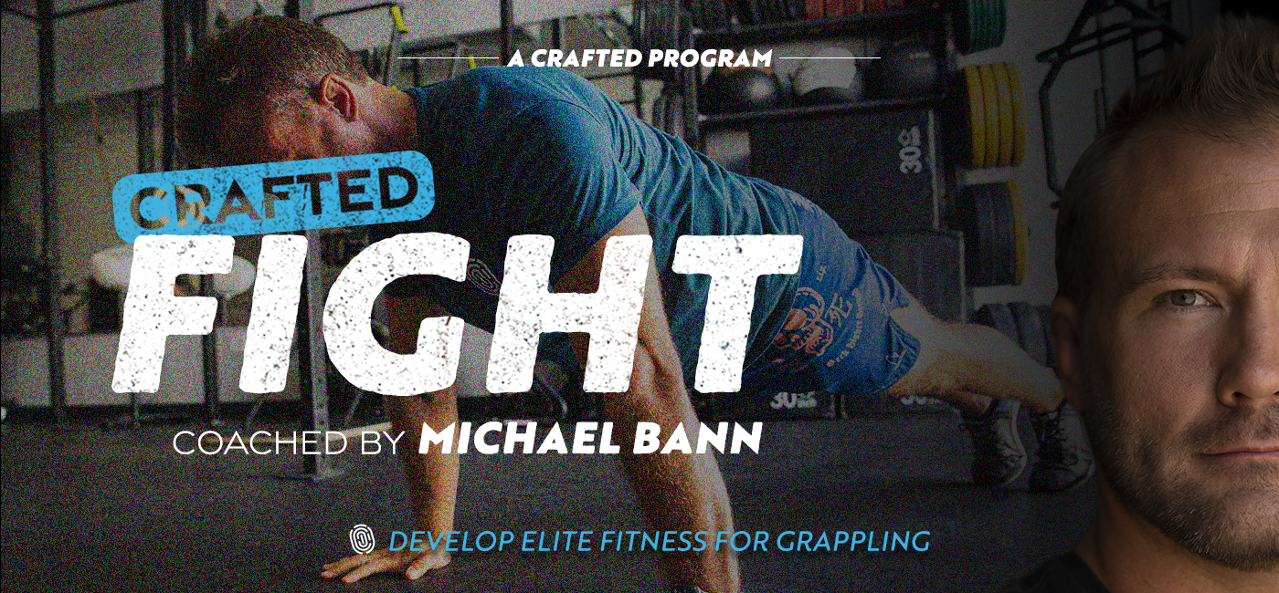
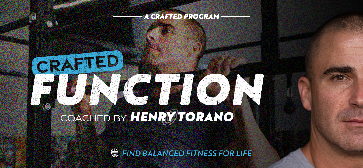
…are how I seek to establish familiarity and trust with our audience. Whether we’re talking about various options of a similar product offering (as in the Crafted Programs campaign) or sequential episodes of a regularly-released podcast (as in the Live a Larger Life episode thumbnails), creating a formula that offers some structure as well as some variety is key to keeping your audience intrigued and enthusiastic while also still following the plot. Here are a couple of campaigns I helped bring to life in such a way.


